


New Releases
EXPLORE →
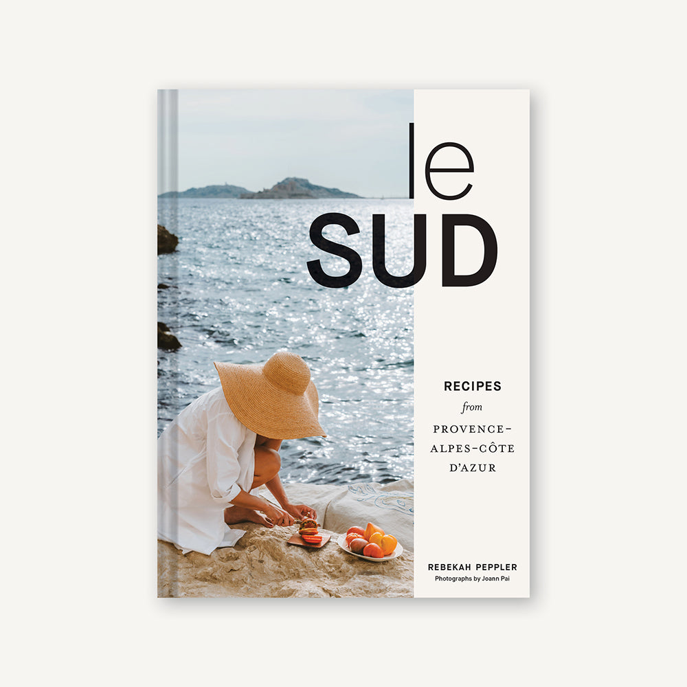


Le Sud
Regular price
- Unit price
Le Sud

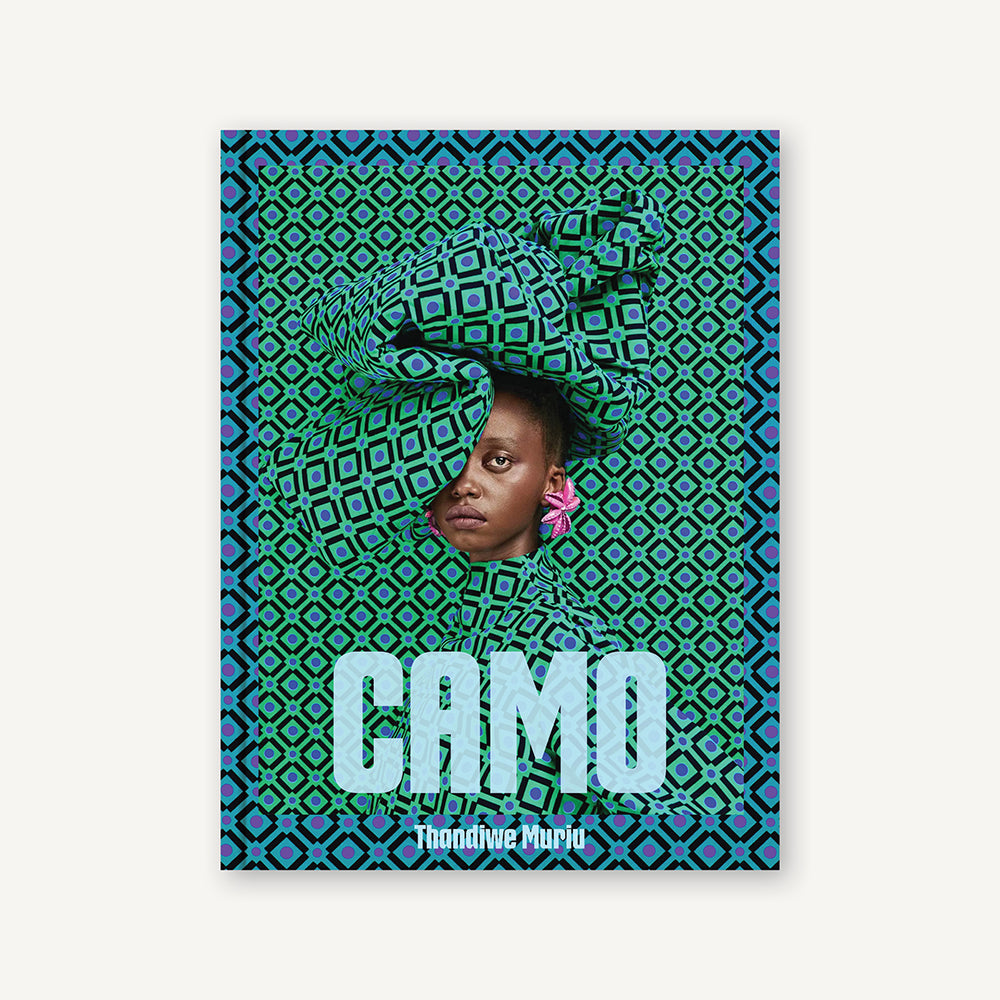


Camo
Regular price
- Unit price
Camo

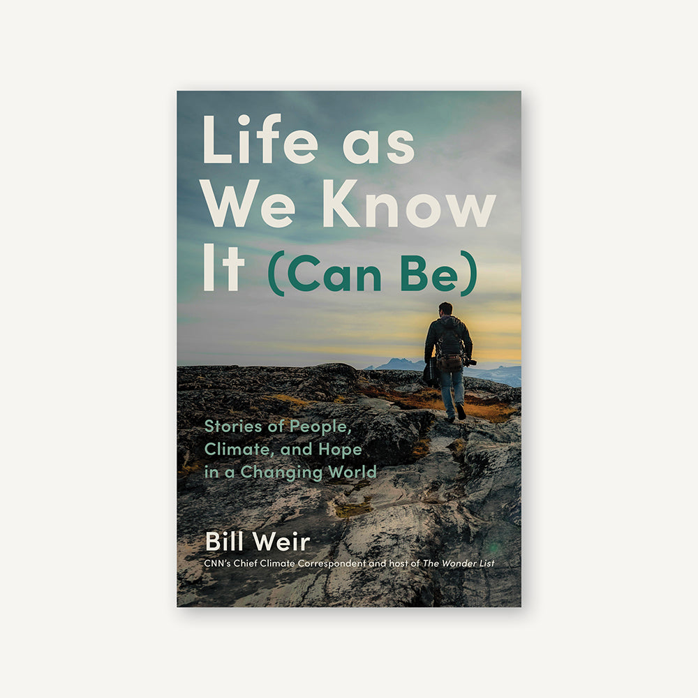

Life as We Know It (Can Be)
Regular price
- Unit price
Life as We Know It (Can Be)

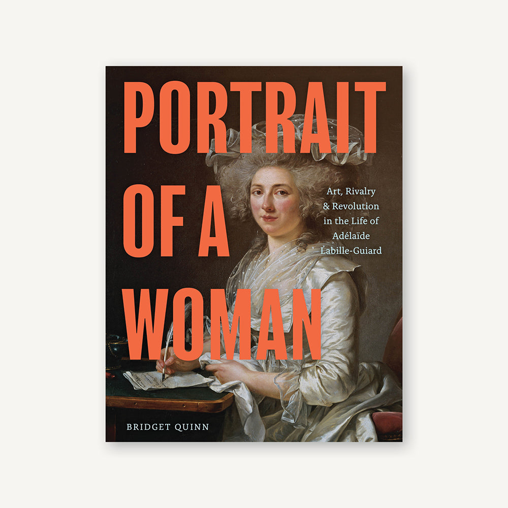


Portrait of a Woman
Regular price
- Unit price
Portrait of a Woman
Children's Books
Explore →
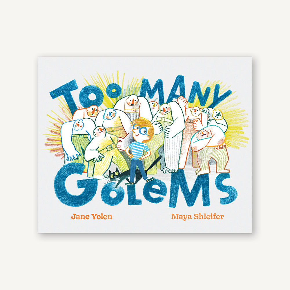

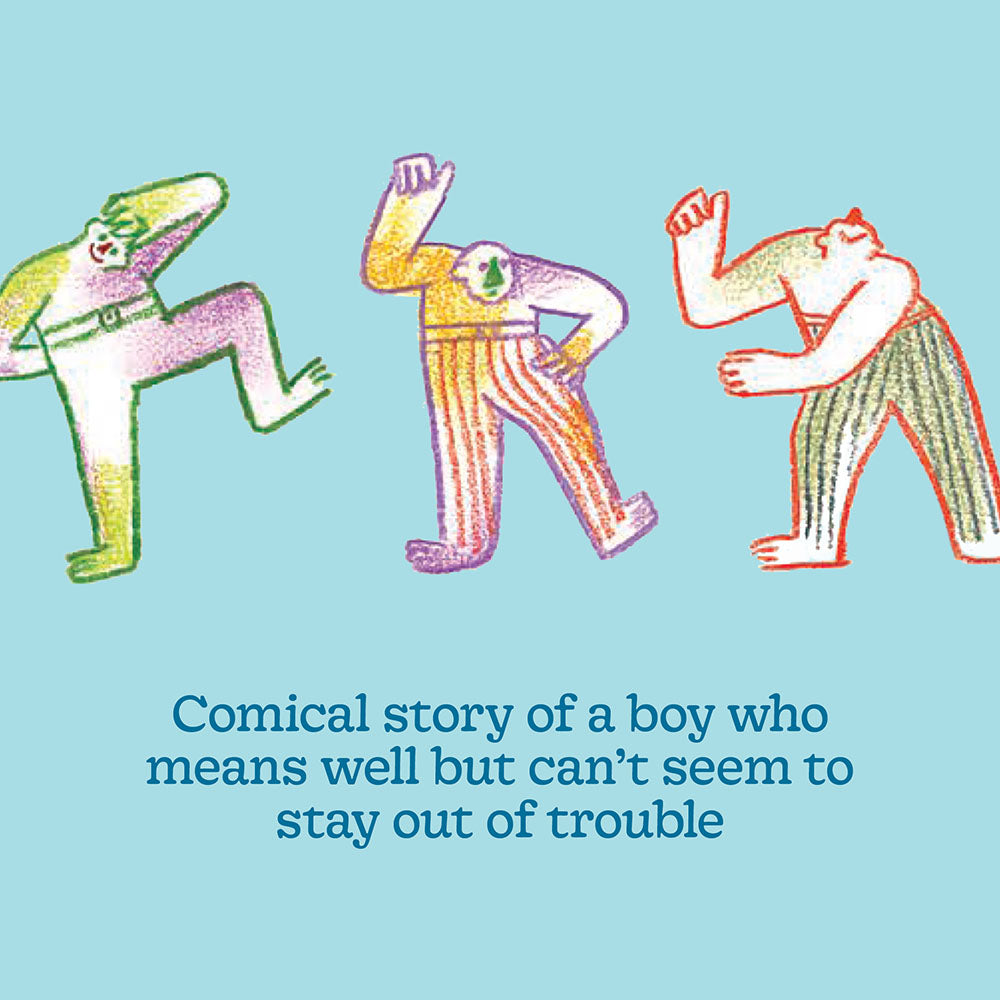
Too Many Golems
Regular price
- Unit price
Too Many Golems

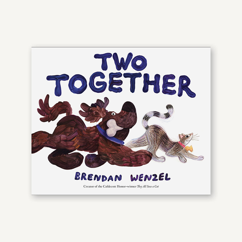

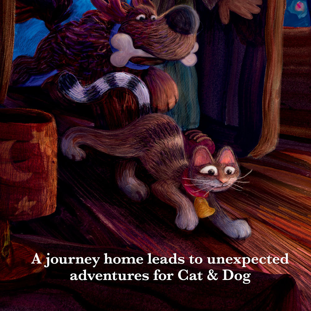
Two Together
Regular price
- Unit price
Two Together

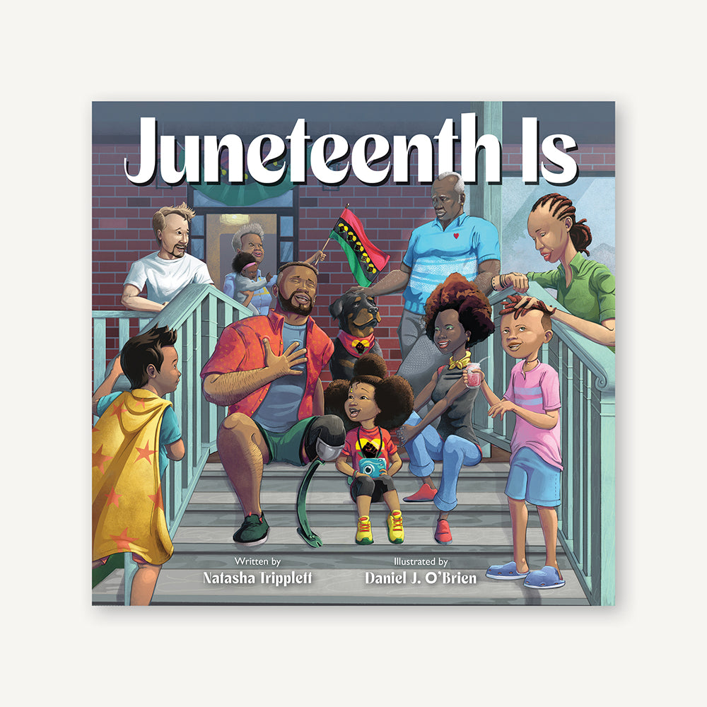

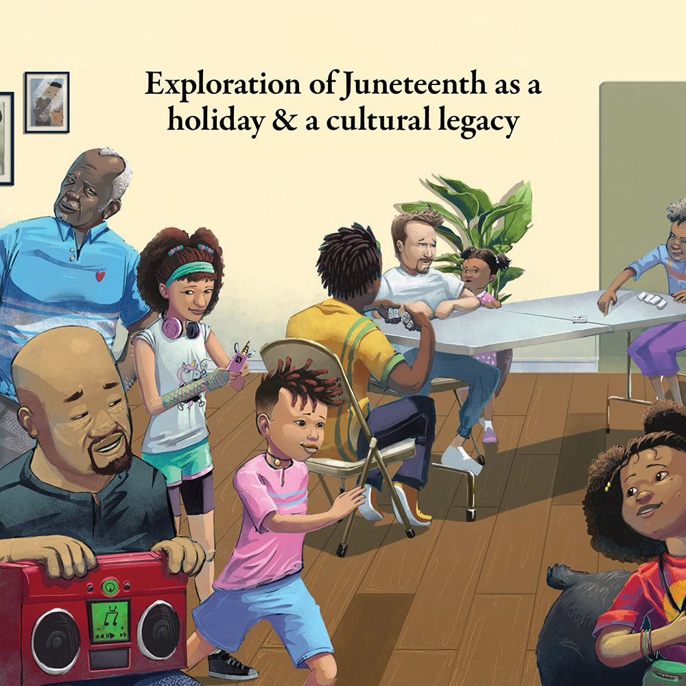
Juneteenth Is
Regular price
- Unit price
Juneteenth Is

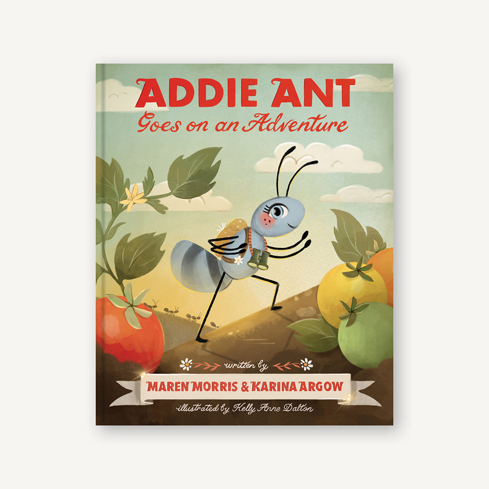

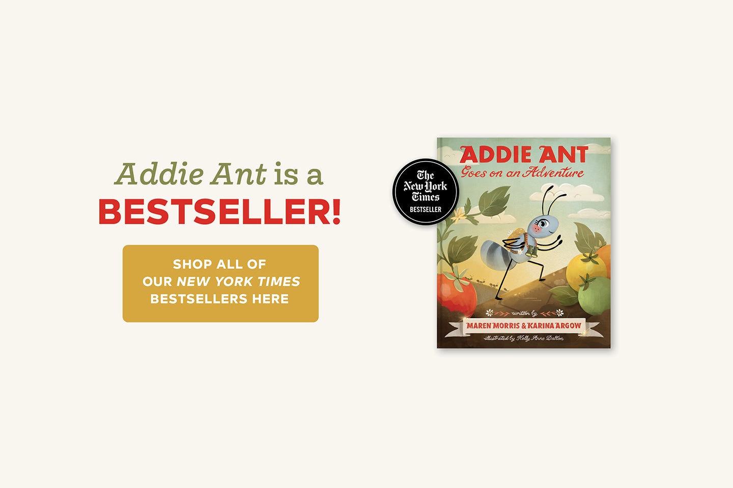
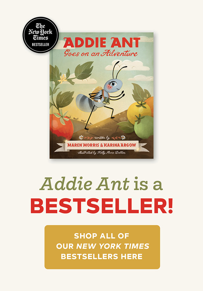
Addie Ant Goes on an Adventure
Regular price
- Unit price
Addie Ant Goes on an Adventure
Puzzles + Games
Browse →
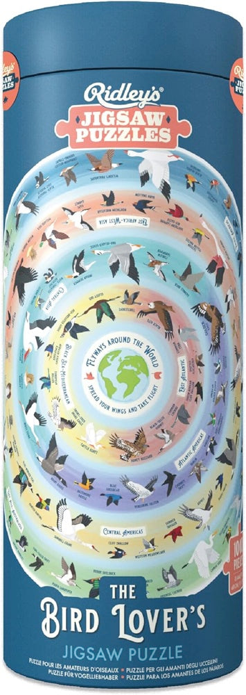

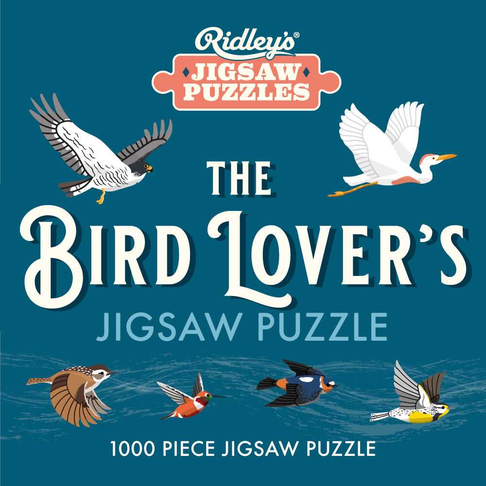
Bird Lover's 1000-Piece Jigsaw Puzzle
Regular price
- Unit price
Bird Lover's 1000-Piece Jigsaw Puzzle

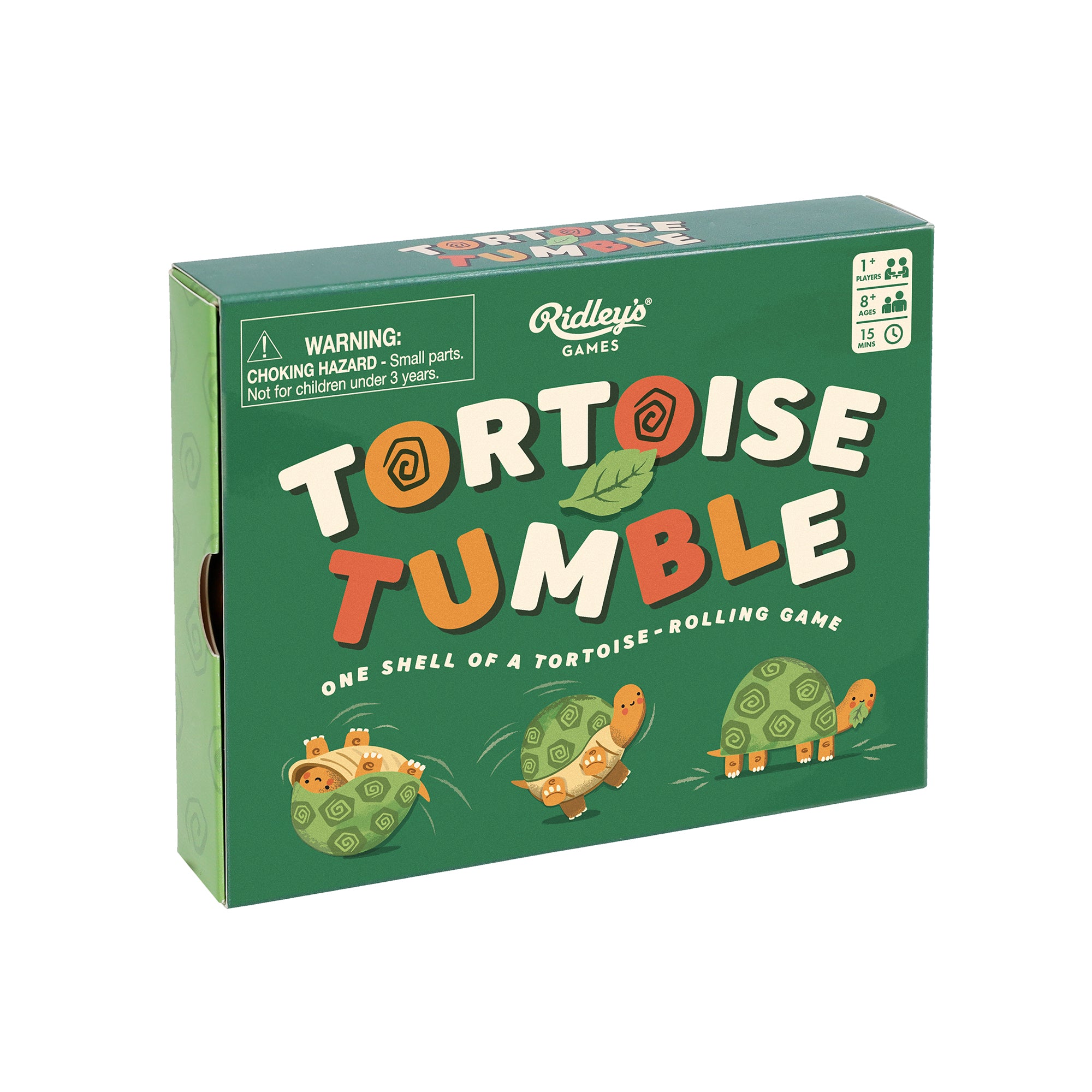

Tortoise Tumble
Regular price
- Unit price
Tortoise Tumble

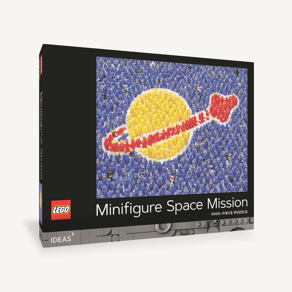

LEGO IDEAS Minifigure Space Mission 1000-Piece Puzzle
Regular price
- Unit price
LEGO IDEAS Minifigure Space Mission 1000-Piece Puzzle

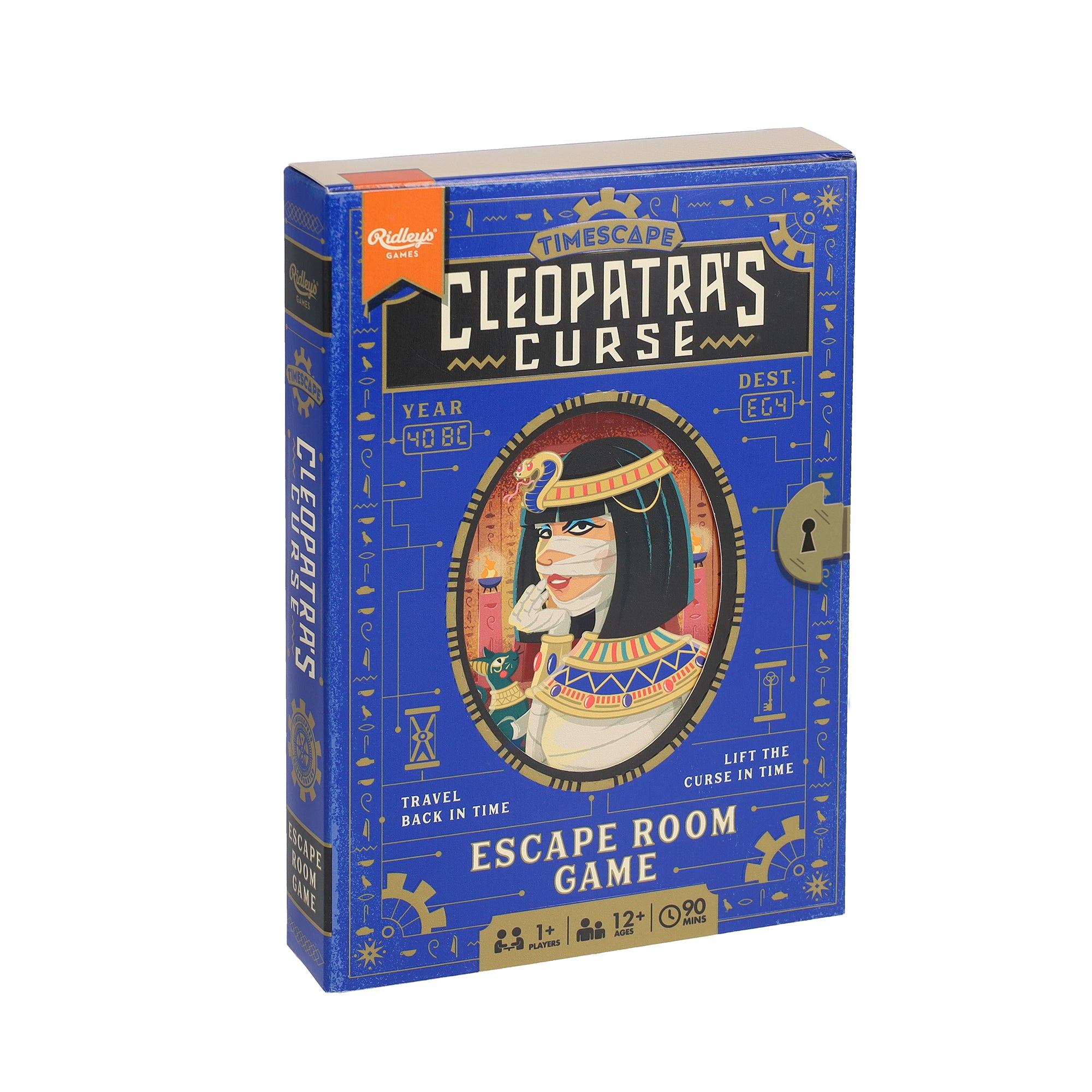

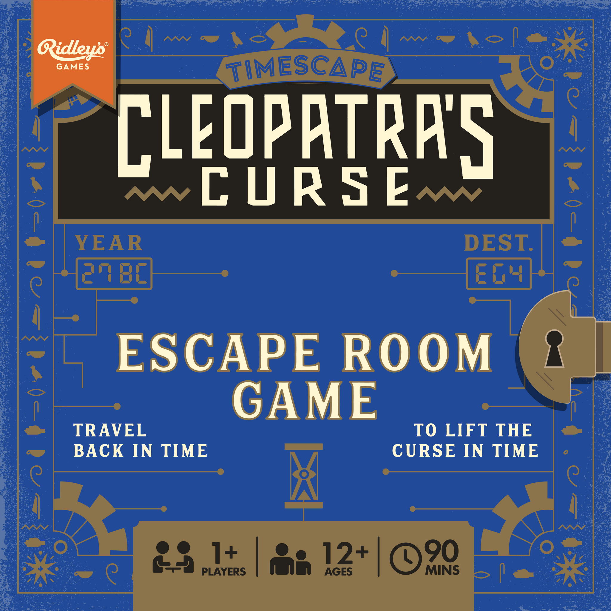
Timescape: Cleopatra's Curse
Regular price
- Unit price
Timescape: Cleopatra's Curse
Stationery + Journals
Browse →
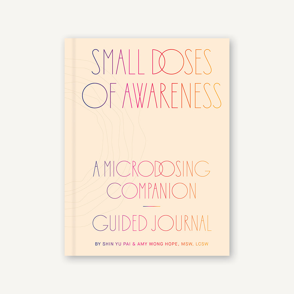

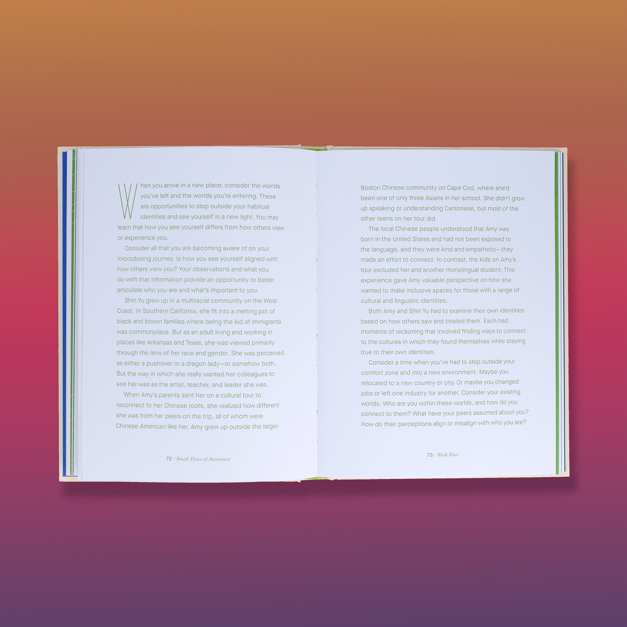
Small Doses of Awareness
Regular price
- Unit price
Small Doses of Awareness

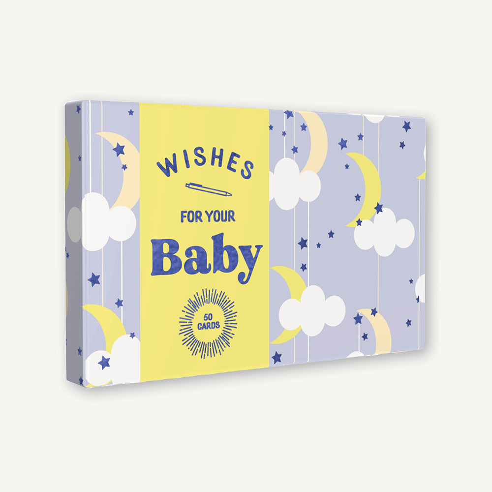


Wishes for Your Baby
Regular price
- Unit price
Wishes for Your Baby

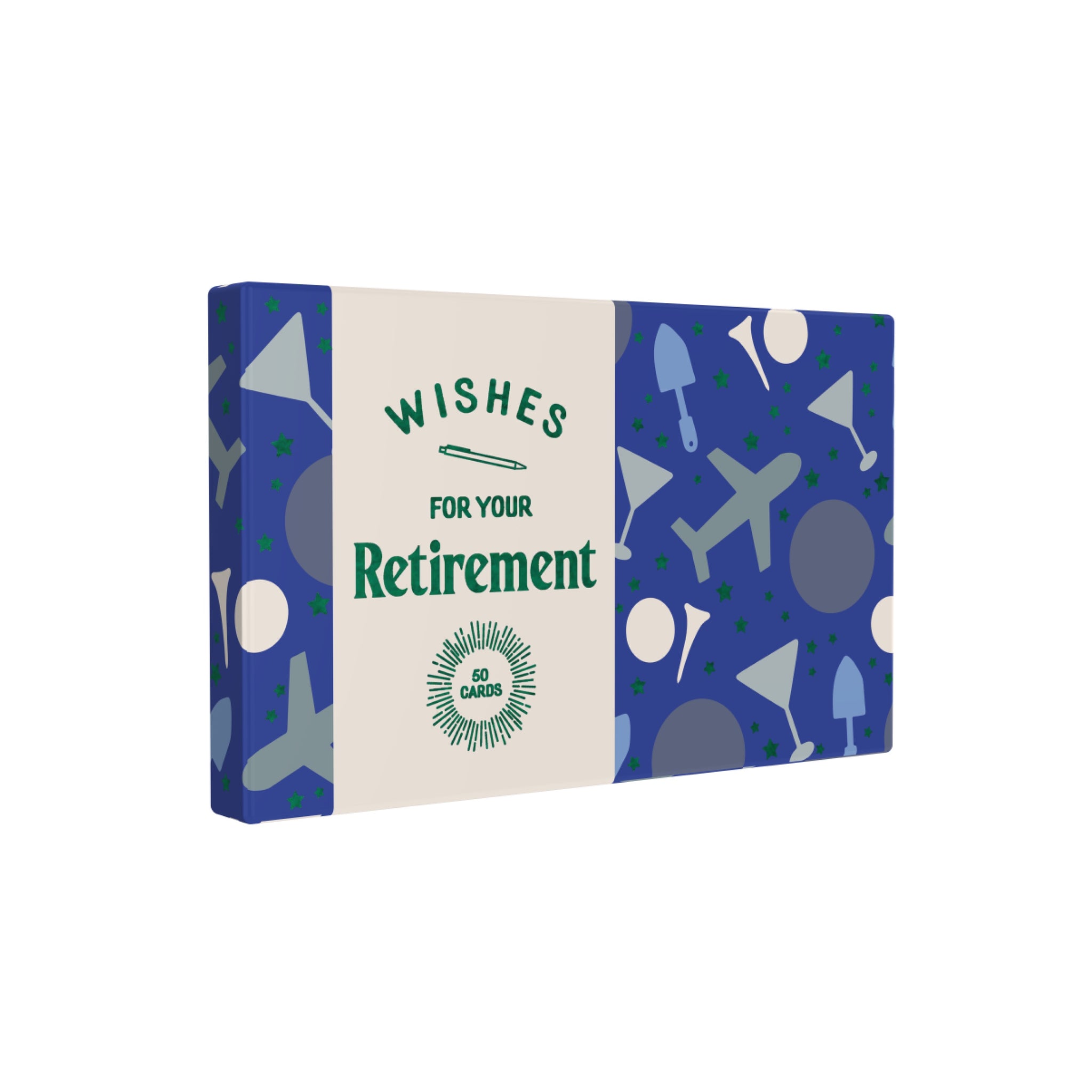


Wishes for Your Retirement
Regular price
- Unit price
Wishes for Your Retirement

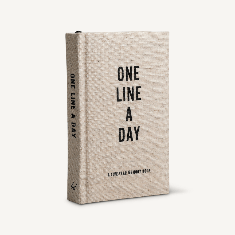

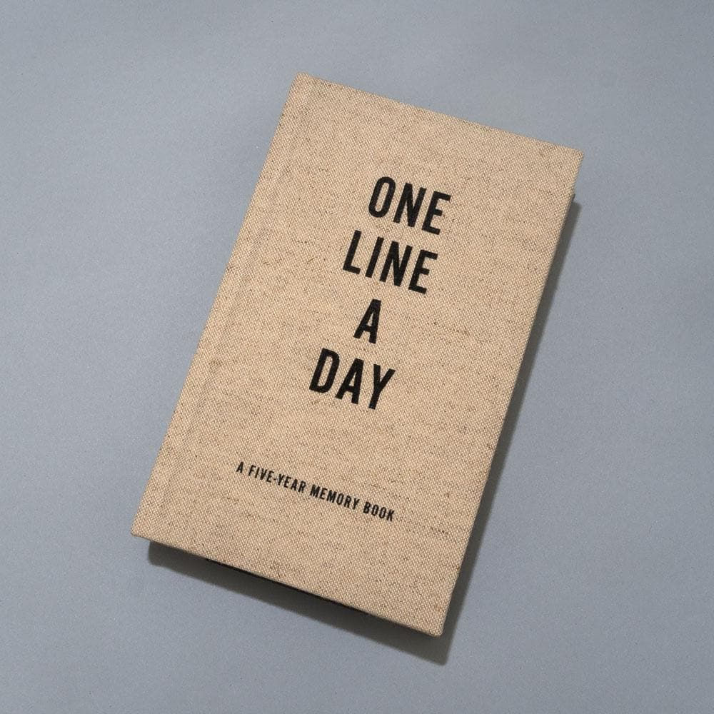
Canvas One Line a Day
Regular price
- Unit price
Canvas One Line a Day

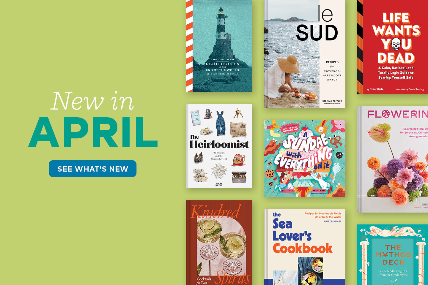
Upcoming
Reserve Your Exclusive Access: Be Among the First to Pre-Order
Upcoming
Reserve Your Exclusive Access: Be Among the First to Pre-Order


See What's New
New from Chronicle Books
See What's New
New from Chronicle Books


Events
Meet Chronicle Books authors and illustrators
Events
Meet Chronicle Books authors and illustrators
See Things Differently With Chronicle Books
Inspired by the enduring magic and importance of books. We create exceptional publishing that's instantly recognizable for its spirit, creativity, and value.